Introduction
Ready to turn data into stories? If you’re spending hours wrestling with raw tables or scrambling to pick the right chart, you’re not alone. Most analysts and writers find themselves stuck in a cycle: pull the data, reshape it, and then figure out how best to show it.
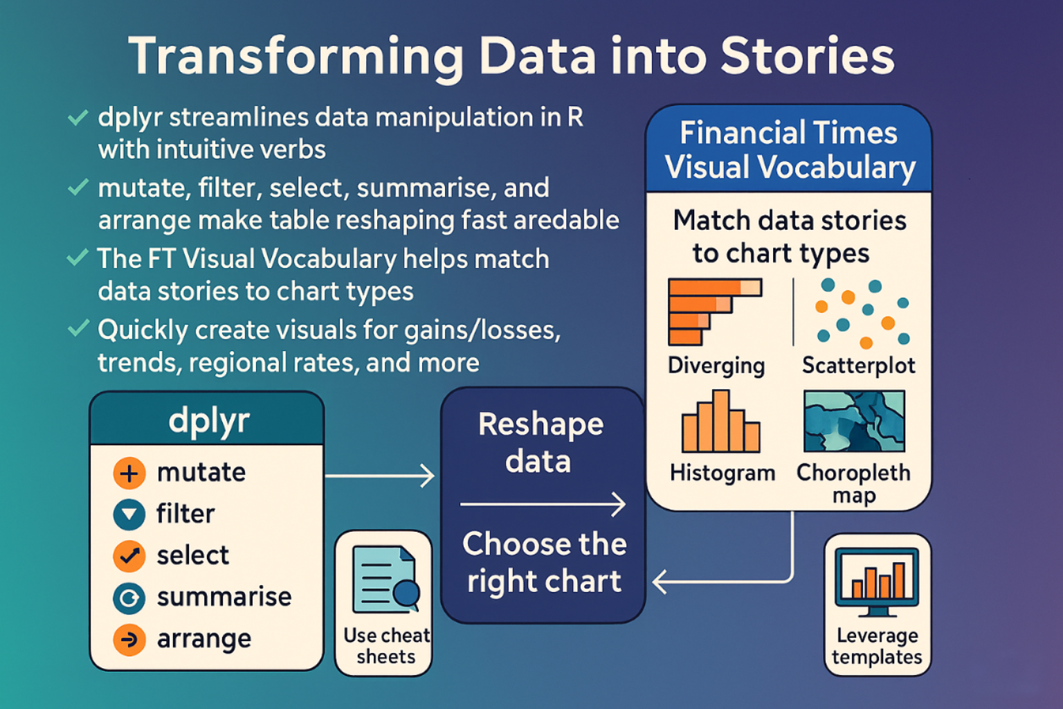
Two tools can help break that cycle and keep your workflow smooth and intuitive:
- dplyr: A set of functions that lets you slice, dice, and polish data in a language that feels like a conversation with the numbers themselves. With verbs like
mutate,filter, andgroup_by, you can add new columns, keep only what you need, and summarize whole groups, all in one tidy line of code. - Financial Times Visual Vocabulary: A quick-reference poster and website that matches common data stories to the chart shape that delivers the clearest insight. From diverging bars for gains and losses to choropleth maps for regional rates, the guide shows you which visual will make the point jump off the page.
Data manipulation packages like dplyr and the reference guides such as FT Visual Vocabulary give you a complete path from raw data to compelling graphics. You can reshape your tables in a snap, then drop them into the right chart style without second-guessing. Grab the tools, follow the cheat sheets, and watch your data transform into clear, engaging stories.
Quick‑Start with dplyr
If you work in R, you’ll spend a lot of time reshaping tables. dplyr turns those chores into a chain of short, readable commands that feel like a conversation with your data.
The core verbs
| Verb | What it does | Example |
|---|---|---|
| mutate() | Adds new columns derived from old ones | mutate(df, bmi = mass / ((height/100)^2)) |
| select() | Keeps only the columns you want | select(df, name, height, mass) |
| filter() | Keeps rows that satisfy a test | filter(df, species == "Droid") |
| summarise() | Reduces many rows to a single value | summarise(df, avg_mass = mean(mass, na.rm = TRUE)) |
| arrange() | Reorders rows | arrange(df, desc(mass)) |
All of these play nicely with group_by(), which lets you apply any of the verbs to each group separately.
A taste with starwars
library(dplyr)
starwars %>% filter(species == "Droid")
# A tibble: 6 × 14
#  name   height  mass hair_color skin_color  eye_color birth_year sex   gender    homeworld species films     vehicles  starships
#  <chr>   <int> <dbl> <chr>      <chr>       <chr>          <dbl> <chr> <chr>     <chr>     <chr>   <list>    <list>    <list>
# 1 C-3PO     167    75 NA         gold        yellow           112 none  masculine Tatooine  Droid   <chr [6]> <chr [0]> <chr [0]>
# 2 R2-D2      96    32 NA         white, blue red               33 none  masculine Naboo     Droid   <chr [7]> <chr [0]> <chr [0]>
# 3 R5-D4      97    32 NA         white, red  red               NA none  masculine Tatooine  Droid   <chr [1]> <chr [0]> <chr [0]>
# 4 IG-88     200   140 none       metal       red               15 none  masculine NA        Droid   <chr [1]> <chr [0]> <chr [0]>
# 5 R4-P17     96    NA none       silver, red red, blue         NA none  feminine  NA        Droid   <chr [2]> <chr [0]> <chr [0]>
# 6 BB8        NA    NA none       none        black             NA none  masculine NA        Droid   <chr [1]> <chr [0]> <chr [0]>
Only the robotic characters appear, each row showing key attributes.
starwars %>% select(name, ends_with("color"))
# A tibble: 87 × 4
#   name               hair_color    skin_color  eye_color
#   <chr>              <chr>         <chr>       <chr>
# 1 Luke Skywalker     blond         fair        blue
# 2 C-3PO              NA            gold        yellow
# 3 R2-D2              NA            white, blue red
# 4 Darth Vader        none          white       yellow
# 5 Leia Organa        brown         light       brown
# 6 Owen Lars          brown, grey   light       blue
# 7 Beru Whitesun Lars brown         light       blue
# 8 R5-D4              NA            white, red  red
# 9 Biggs Darklighter  black         light       brown
# ℹ 77 more rows
Grab the colour columns in one sweep, keeping the names tidy.
starwars %>%
  mutate(name, bmi = mass / ((height / 100)  ^ 2)) %>%
  select(name:mass, bmi)
#> # A tibble: 87 × 4
#>   name           height  mass   bmi
#>   <chr>           <int> <dbl> <dbl>
#> 1 Luke Skywalker    172    77  26.0
#> 2 C-3PO             167    75  26.9
#> 3 R2-D2              96    32  34.7
#> 4 Darth Vader       202   136  33.3
#> 5 Leia Organa       150    49  21.8
#> # ℹ 82 more rows
A quick BMI calculation, then a tidy display of the results.
starwars %>%
  arrange(desc(mass))
#> # A tibble: 87 × 14
#>   name      height  mass hair_color skin_color eye_color birth_year sex   gender
#>   <chr>      <int> <dbl> <chr>      <chr>      <chr>          <dbl> <chr> <chr>
#> 1 Jabba De…    175  1358 <NA>       green-tan… orange         600   herm… mascu…
#> 2 Grievous     216   159 none       brown, wh… green, y…       NA   male  mascu…
#> 3 IG-88        200   140 none       metal      red             15   none  mascu…
#> 4 Darth Va…    202   136 none       white      yellow          41.9 male  mascu…
#> 5 Tarfful      234   136 brown      brown      blue            NA   male  mascu…
#> # ℹ 82 more rows
#> # ℹ 5 more variables: homeworld <chr>, species <chr>, films <list>,
#> #   vehicles <list>, starships <list>
The heaviest characters jump to the top of the list.
starwars %>%
  group_by(species) %>%
  summarise(
    n = n(),
    mass = mean(mass, na.rm = TRUE)
  ) %>%
  filter(
    n > 1,
    mass > 50
  )
#> # A tibble: 9 × 3
#>   species      n  mass
#>   <chr>    <int> <dbl>
#> 1 Droid        6  69.8
#> 2 Gungan       3  74
#> 3 Human       35  81.3
#> 4 Kaminoan     2  88
#> 5 Mirialan     2  53.1
#> # ℹ 4 more rows
Species that appear more than once and weigh more than 50 kg surface in a concise summary.
Installing
The simplest route is to bring in the tidyverse bundle:
install.packages("tidyverse")
If you prefer a leaner install:
install.packages("dplyr")
A bleeding-edge copy, useful when a new feature lands early, comes from GitHub:
pak::pak("tidyverse/dplyr")
Quick reference
A cheat sheet is available to keep commands in mind without memorizing every syntax detail.
dplyr lets you slice, dice, and summarize data in a language that feels natural. Once you build a few pipelines, you’ll find that transforming raw tables into insights becomes a matter of a few expressive lines instead of a maze of loops and temporary objects.
Charting a New Language: Inside the Financial Times Visual Vocabulary
Data is everywhere. A good chart turns a pile of numbers into a quick, clear idea. The Financial Times has built a “Visual Vocabulary” to help analysts, writers, editors and designers pick the right visual for each story. Think of it as a cheat-sheet for the most common chart shapes and when each one shines.

What is the FT Visual Vocabulary?
- A poster (print-ready and printable in English, Japanese, Chinese – both traditional and simplified)
- A website that lets you filter chart types by purpose
- A GitHub repo with D3 templates so you can spin up a chart in the FT style in minutes
A quick tour of some favorite chart types
| Category | Chart | When to use it |
|---|---|---|
| Deviation | Diverging bar | Show positive vs negative values (e.g. trade surplus vs deficit) |
| Correlation | Scatterplot | Spot a trend or lack of one between two continuous variables |
| Ranking | Ordered bar | Rank items when the value itself is less important than the order |
| Distribution | Histogram | See how many observations fall into each range |
| Change over time | Line chart | Follow a single series over time – the default go-to |
| Part-to-whole | Stacked column | Break a total into parts when the whole matters |
| Magnitude | Column chart | Compare absolute sizes (e.g. GDP of countries) |
| Spatial | Choropleth map | Show a rate or ratio across regions |
| Flow | Sankey diagram | Track how amounts move from one group to another |
Each shape has a subtle rule: start at zero on the axis for columns, keep bars sorted for rankings, show negative values with a dash, etc. The poster pulls all those rules together so you can decide quickly without getting lost.
Why bother with a visual vocabulary?
- Speed - You can look at a data set and see the chart that fits in an instant.
- Clarity - Using the right shape reduces the chance the reader misses the point.
- Consistency - Even if you’re working with a new team, everyone can read the same chart “language.”
- Quality - The FT’s training sessions use the vocabulary to spot weak visual choices before a story hits the press.
The idea behind the Visual Vocabulary comes from the “Graphical Continuum,” a book that maps chart shapes to how data is used. The FT keeps the same spirit but simplifies it to everyday decisions.
Getting the tools
- Print the poster – the FT keeps a high-resolution PDF that you can print at home or in a newsroom.
- Explore the website – filter by “deviation” or “ranking” and the list shrinks to the charts that fit.
- Clone the repo – If you love coding, the D3 templates let you drop in a new chart with minimal tweaking. The GitHub folder also contains a style guide that explains the color palette, font usage and label tricks.
That way every chart looks recognizable even if you’re pulling it from data you didn’t create.
The FT Visual Vocabulary is a living toolkit that shows you how to match a data story to a visual shape. Whether you’re writing a news piece, editing a report, or designing a feature, the poster tells you which chart to pick in a heartbeat.
Conclusion
When you’re ready to turn a stack of numbers into something that people can see and feel, the two pieces we’ve covered give you a perfect data storytelling playbook. Try dplyr: it lets you slice, filter, and re-shape data in a handful of readable lines, so you can spend less time wrestling with loops and more time asking the right questions. Then choose a chart shape with help of the Visual Vocabulary and then drop the data into the D3 template you prefer.
So why wait? Pick a table, pick a chart, and let the numbers speak in a language everyone can read.